My Role: Website | Marketing | Branding | Animation | Working a distributed team |
2018 December - 2019 January
Overview
Cerebra is a pre-seed device management startup that I joined as they were preparing to work with their initial Beta users. They were seeking to update their website to bolster their brand and reflect their mission to make life easier for IT administrators.
My Role
I joined the team as a Product designer and for the following month I worked closely with the CEO and a developer on fine tuning Cerebra’s look and messaging.
Process
There four main parts of my process that I will illustrate in the rest of this post are:
Research
Interaction Design
Visual Design
Responsiveness
1. Research
To make an effective design, I needed to know the answer to two questions:
What are Cerebra’s goals for the near future?
Who is Cerebra’s target audience?
Cerebra’s goals
To answer the first question, during the kick off, I used the startup development stages diagram as a prop to facilitate that conversation. Even though startups don’t necessarily fit neatly the development stages in their growth, it still makes for a good conversation about where a company is and what’s ahead.
The green box shows where Cerebra falls in its growth phases
Here are two critical things I learned during the kickoff that affected the direction of the design:
Cerebra was not looking to attract more Beta Customers. The priority was to provide the best experience for its first users and build a durable relationship with them.
At the time, the most significant target audience for Cerebra were tech startups.
Target audience
Based on what I learned about the problem space, I defined two main target audiences for the website:
Direct Beta Users:
These are usually startups or small businesses.
They need an affordable device management solution to meet compliance requirements.
They have already seen the CEO’s presentation and are coming to the website to sign up for the beta program.
Potential Beta Users:
These are companies that find their way to Cerebra either from a third party, or through recommendations.
They are looking to validate that Cerebra is the right product for them.
I did leave out cold traffic because at that point Cerebra was not focused on increasing its user base. Also, converting cold traffic would have extended beyond just the website itself and would have required a complete marketing strategy.
2. Interaction Design
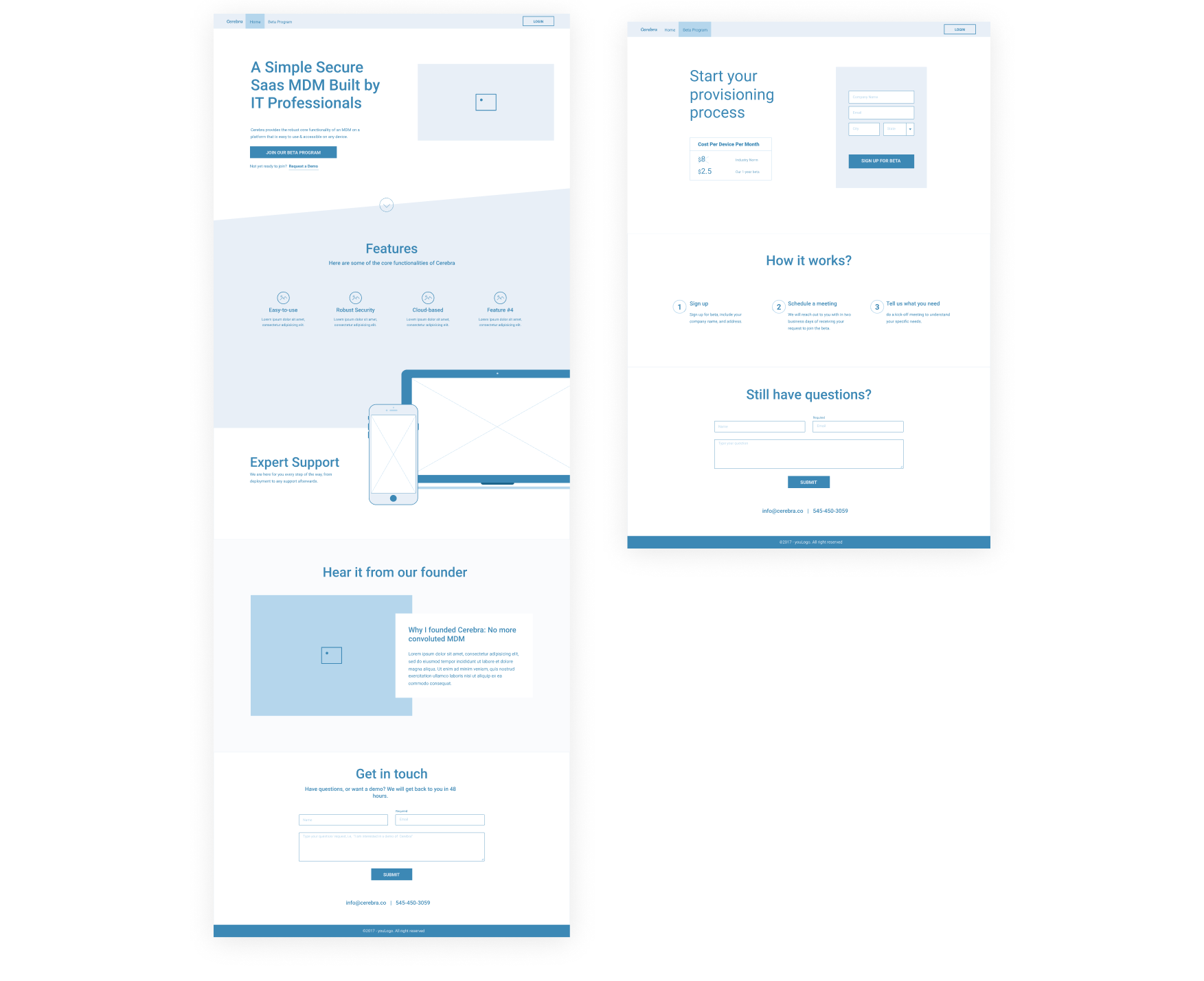
After getting a clear idea of Cerebra’s goals and audience, I started exploring the websites structure and the components that could best carry its message. Most of the explorations and discussions happened around low- to mid-fidelity wireframes. But for the sake of clarity in this post, I will also include some high fidelity designs.
Based on the needs of the different target audiences, I divided the website into two main pages:
Home Page
Beta Page
Home Page
The goal of the homepage is to give potential beta users a clear idea of what cerebra does, how they stand to benefit from it, and help build trust in them.
First, I present visitors with a clear value proposition, followed by what benefits they would gain by working with Cerebra.
Next, I tell them more about Cerebra’s mission and its founder in a narrative form. That is a critical step, especially because at the time Cerebra could not yet display any testimonials.
Cerebra’s founder has experienced the pain of IT admin first-hand, and by emphasizing his understanding and commitment, we could underscore Cerebra’s authenticity.
Finally, I finish off by inviting the visitors to ask for a demo. Also, for those who need less convincing, I provide a link upfront to request a demo.
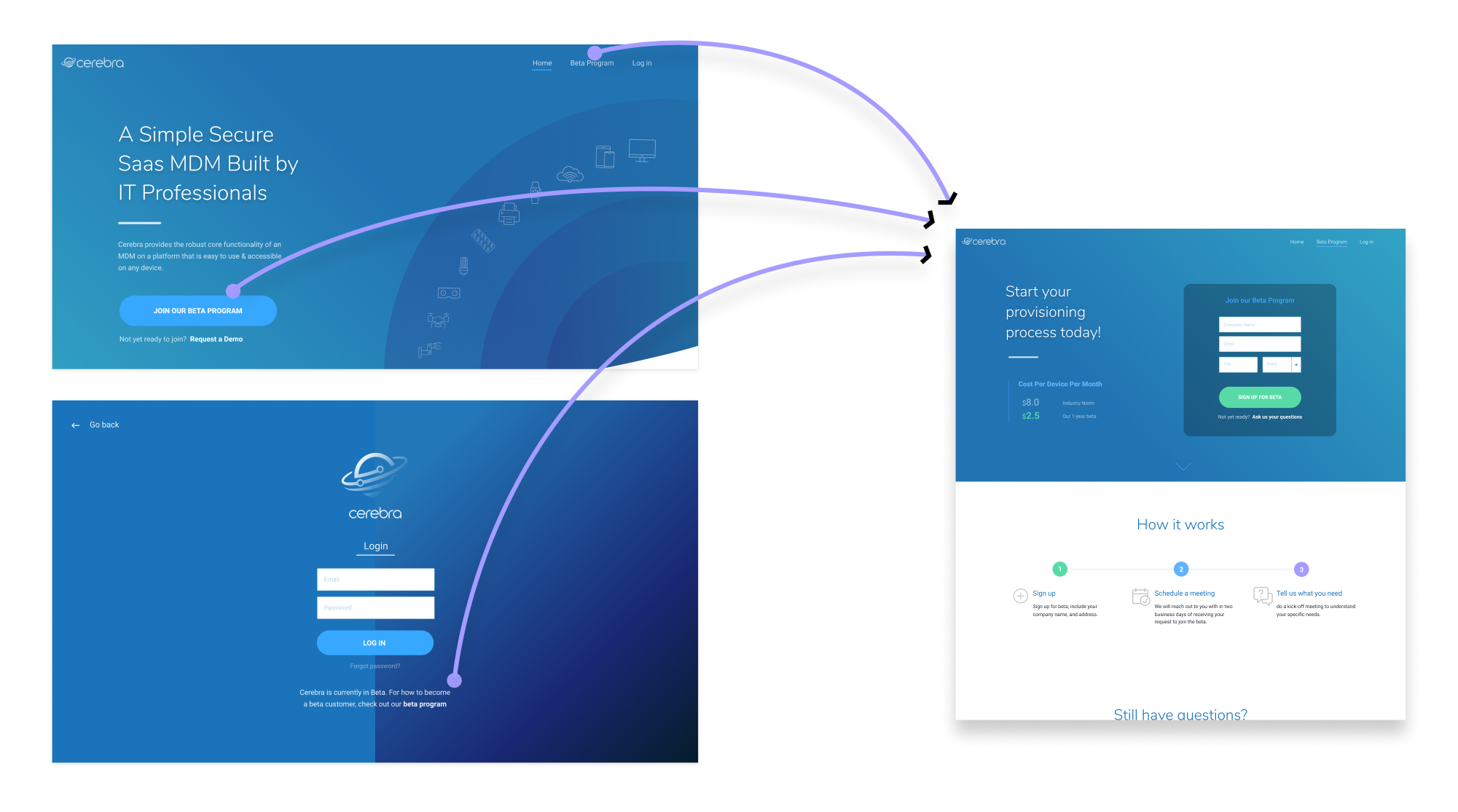
Beta Page Navigation
The goal of the beta page is to give direct beta users a clear pathway to join the beta program.
The visitors can find their way to the beta page either from the link in the global navigation, or with a call-to-action button on the the homepage.
Visitors can find their way to beta page through three different paths
Additionally, since signing up for Cerebra at that point could really only happen by joining the beta program, I also included a pathway from the login page to usher visitors without an account to the beta page.
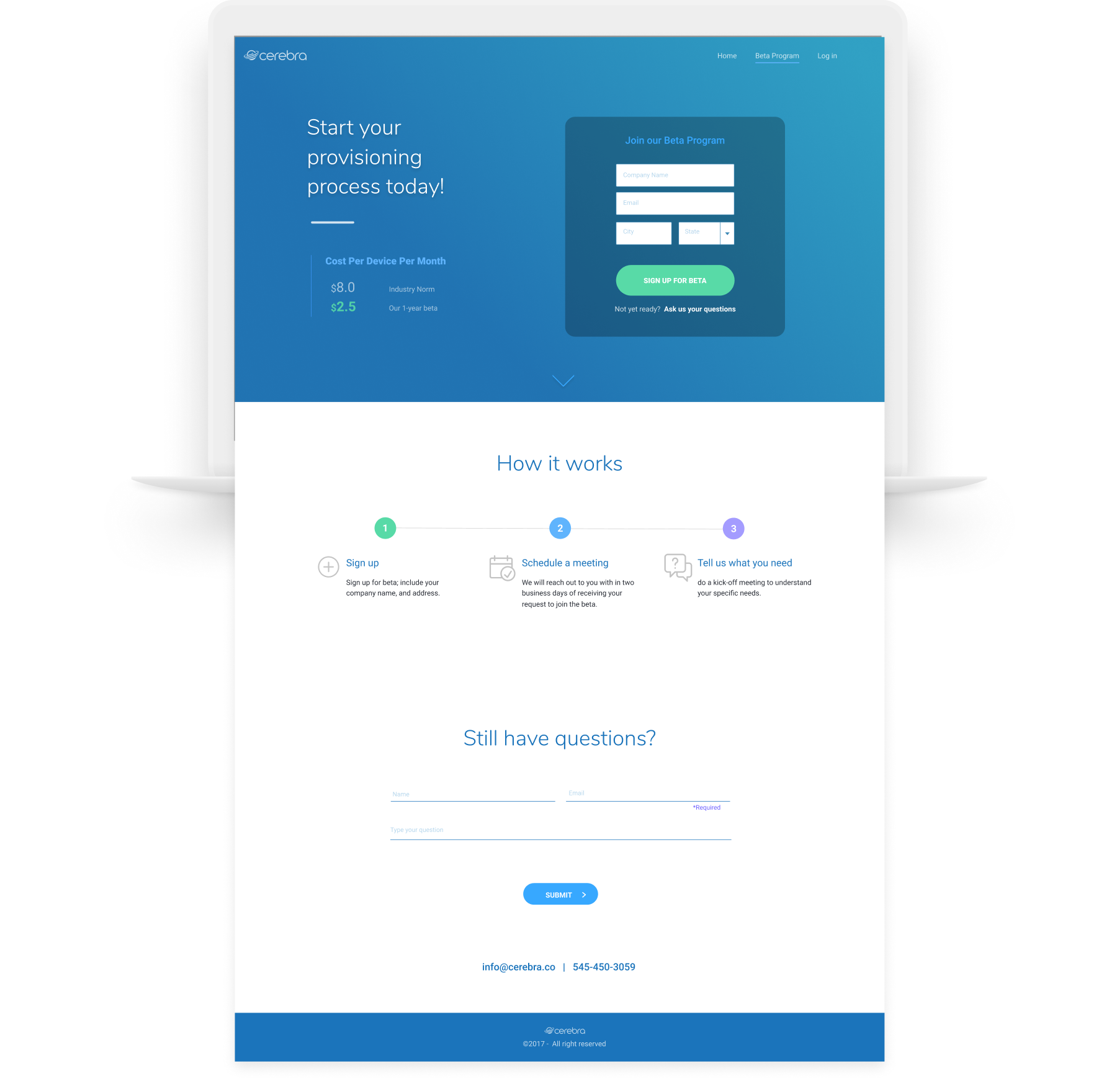
Beta Page
Once on the beta page, the first thing they see is the form to join the beta program, and juxtaposed to it is information that serves as a nudge to remind them what they will gain by joining Cerebra.
Next, they are shown a step-by-step break-down of what they can expect during the enrollment process, and they have the chance to ask questions.
3. Visual Design
After establishing the structure and the functional components of the website, I started working on its branding and visual design.
Mood Board
As part of the collaborative process, I asked the CEO to send me a couple of websites that appealed to him. I used that collection as a way to analyze his visual interests. Broadly, speaking, he was drawn to clean airy designs, with bold illustrations, something I took into consideration as I started putting together a mood board.
I also had a conversation with the CEO about what prompted him to choose “Cerebra” as the trademark for his company.
I created the mood board as a device for myself to organize the direction of the visual design and the aesthetic of the website. At the same time, it allowed me reveal my thinking to Cerebra team members and include them in the conversation.
The board had two main sections:
One that explored clean, neat visual elements.
Another that drew on bold imagery and scifi based on my conversations with the team.
Fonts
When I joined Cerebra, the logo was already finalized. The typeface of the logo is round and curvy, intensified by the logo image of a planet with smooth curving orbits. At the time, Cerebra was only using Roboto as its main typeface.
I wanted to introduce a second typeface that would bridge the sharp shift from the curves of the logo to the geometric shapes of Roboto.
I settled on Nunito, because of its round and plump line quality, and because at the same time it work well with Roboto.
Colors
Referring back to the mood board, there were two sets of colors, both of them inspired by the scifi and galactic themes:
Dark Blue
Purple
To understand how the different style components worked together, I made different versions of the homepage, which allowed me to solicit Cerebra’s input on the designs. Whatever style we would agree on for the homepage, I would then extend to the rest of the pages.
Animation
The animation is part of the hero image for laptops and larger screen sizes.
This is how the animation loads:
It had three sources of inspiration:
In the marvel comics, Cerebra can speak and control any human
The planet and its orbits inside the logo are in a way a metaphor for cloud-controlled devices.
The planet in the logo is part of the infinite expanse of the galaxy, a metaphor for the ever expanding universe of devices and system that an MDM needs to handle.
In the final version, the core circle represents Cerebra MDM. The orbit stands for its sphere of influence, and Cerebra controls and monitors devices of all sorts wirelessly.
This is how the animation loops after loading:
4. Responsive
An important consideration was to make the website responsive.
After making the web version, I also fully designed how it would look on mobile.
Then as part of the final deliverables, I submitted a “guideline for responsive design” that gave a sense of how the website needs to behave with different screen sizes, for example, how the grids would change or how screen size would affect the hero image.
Final thoughts
The main challenge was to find a workflow that suited working in a distributed team. I found that clarity in communication was key, and it was important to keep my work organized from the start.
I also had to modify some of my old workflows. For example, I started using Loom, a video presentation add-on. Video presentations reduced the burden of scheduling, especially when an immediate collaborative discussion was not necessary.
Another example of how I changed my process was the kick off meeting. I broke it into three parts.
An In-person meet-and-greet to build rapport and understand Cerebra’s goals.
A survey, to dig deeper into what I had learned about Cerebra.
A wrap-up video presentation on my thoughts and the plan forward.
Finally, the choice of a design tool plays an important role to facilitate remote workflow. I used Figma on this project because it is optimized for collaboration, and cost-effective.


