Product Summary
The Campers app addresses coordination issues in group camping. Most camping digital services cater to lone travellers, leaving people camping in a group with the daunting task of coordination.
“Camping is fun, until you realize that you have forgotten the tent at home!
- Experienced Camper
”
I intentionally steered away from a generic task management app. The objective was not only to facilitate coordination, but also to lighten up a stressful activity through a targeted visual language and mircrointeractions.
Product Walkthrough
User Flow Diagram
The interplay between invitations and task management is the most challenging part of organizing a group camping ( see Communication Flow Diagrams). The highlighted areas in the diagram below tell the story of how a camper organizes a trip through the app.
Main Interactions
Organizers can invite people and assign tasks to them.
Organizers can keep track of the progress of different tasks.
Organizers can view and change invitations and task assignments at any time.
Campers can easily communicate their status or any concerns with the organizers.
You can Refer to process for details on my research
1. Invitations
2. Tasks
3. Control
4. Status updates
Micro-interactions
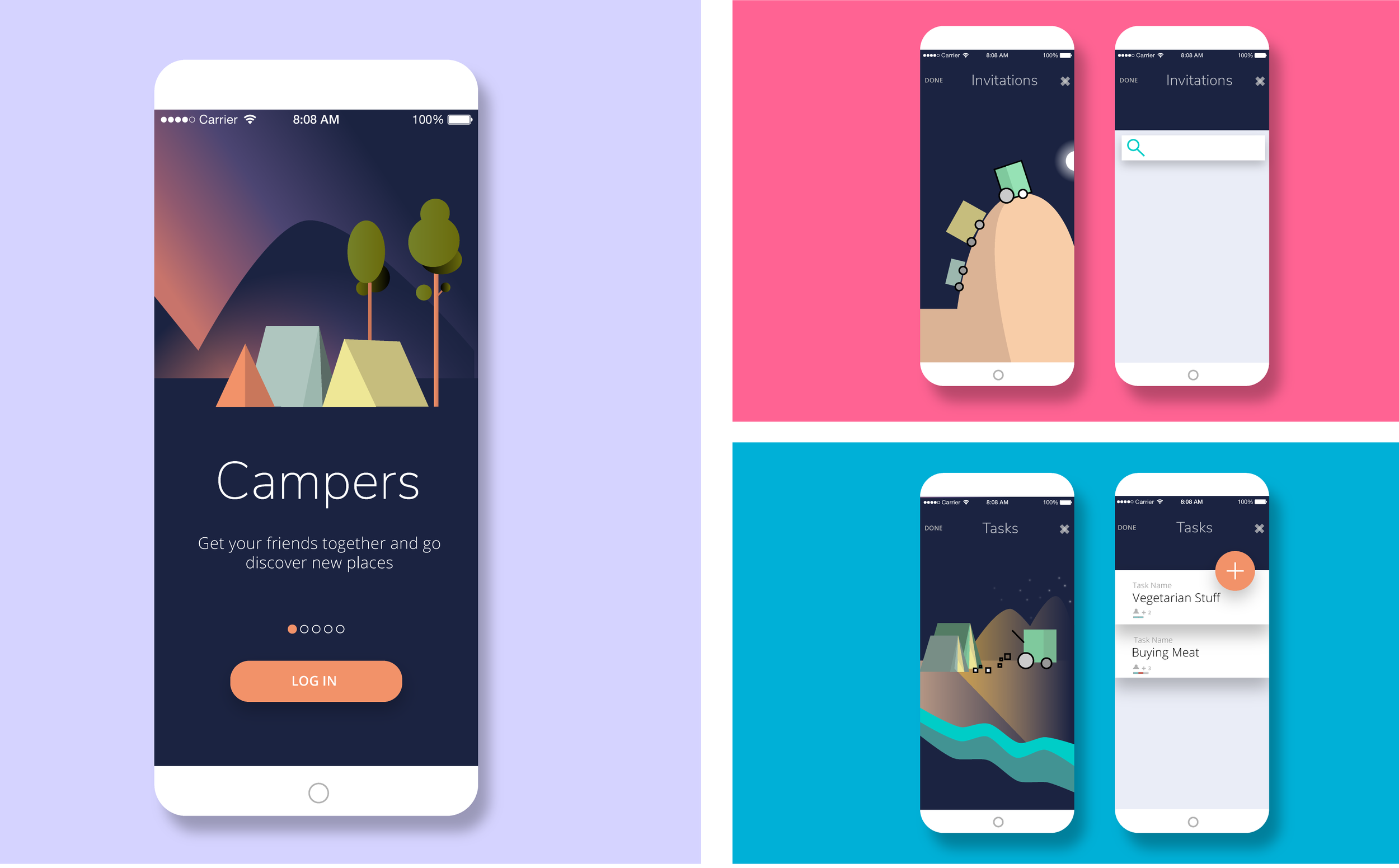
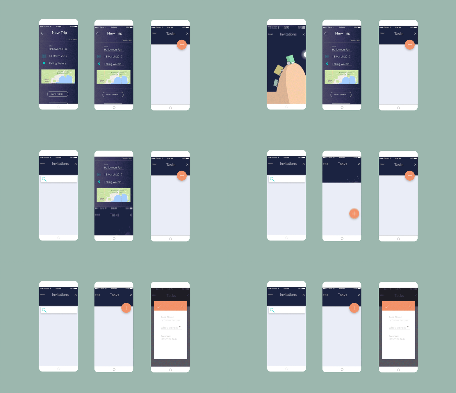
Transitions are the perfect moment to inject delight without distracting a camper from their main task.
The graphic illustrations can quickly communicate the goal of a transition and communicate the app' personality and brand.
A. Invitation Transition
B. Tasks Transition
Process
I made Campers as part of a mobile design project at Carnegie Mellon University. As a novice camper, I was interested to learn from experienced campers and understand their pain points.
Interviews
Problem identification
Experience map
Communication flow diagram
Competitive Analysis
Ideation
Paper Prototyping
User testing
Animation
High-fidelity testing
Conclusion
Interviews
I interviewed five experienced campers, three males and two females. I turned to directed storytelling to allow these campers to surface what seemed noteworthy to them.
All stories shared three key phases:
Problem Identification
Something that seemed to make a difference in people’s camping experiences was whether or not they were in a group ( three or more people).
When in a group, not only did they have to worry about where to camp and what to take with them, but they also had to manage group coordination.
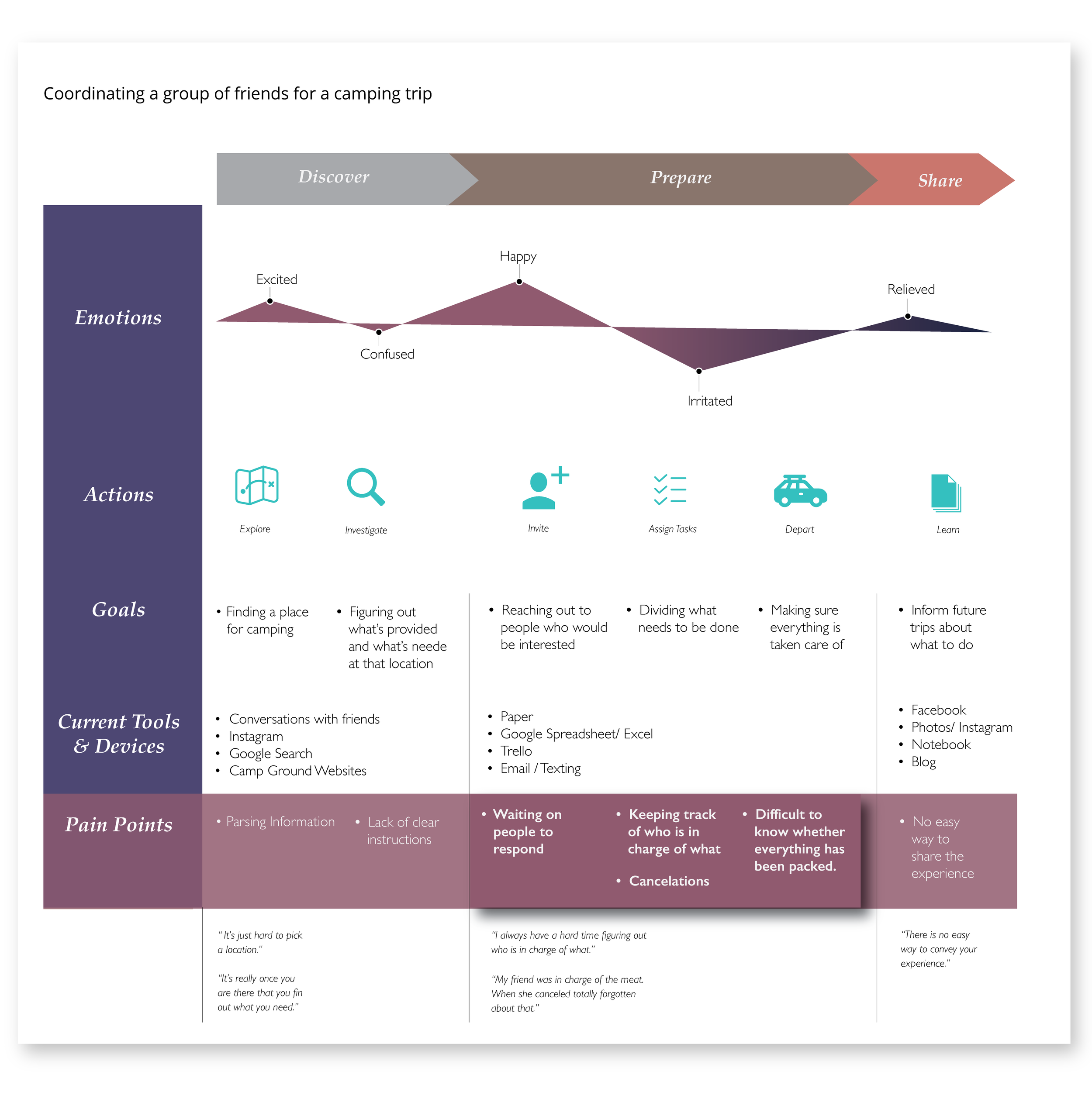
Experience Map
I consolidated all the interviews related to camping in a group into an experience map. Even though there were coordination issues at every phase, campers were most frustrated about task management during the preparation phase.
Communication Flow Diagrams
Taking the preparation phase further apart, I diagramed the communication flow and the possible reasons for miscommunication. Cancelations and charging multiple people with the same task were two of the main reasons for tasks left undone.
Competitive Analysis
Next, I looked at three of the high ranking camping apps on Apple Store. My main goal was to gage how well they meet some of the needs I had uncovered so far in my research .
None of the apps addressed communication and sharing. They mostly focused on lone campers.
Ideation
I concentrated the design on easing coordination to ensure no task is left undone. Drawing on my research, I first created a concept model of the major functions the app would have to fulfill, and then came up the app flow.
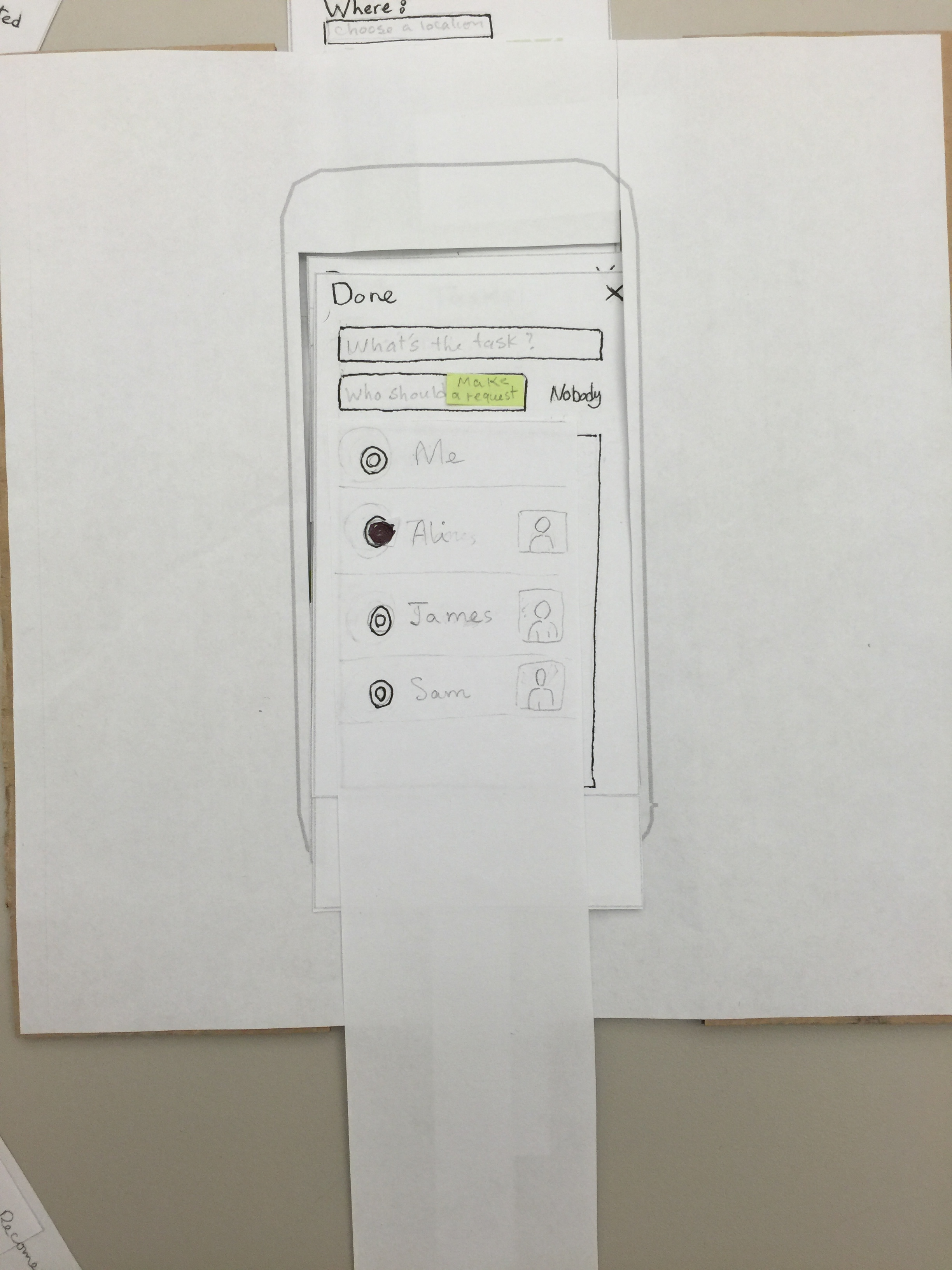
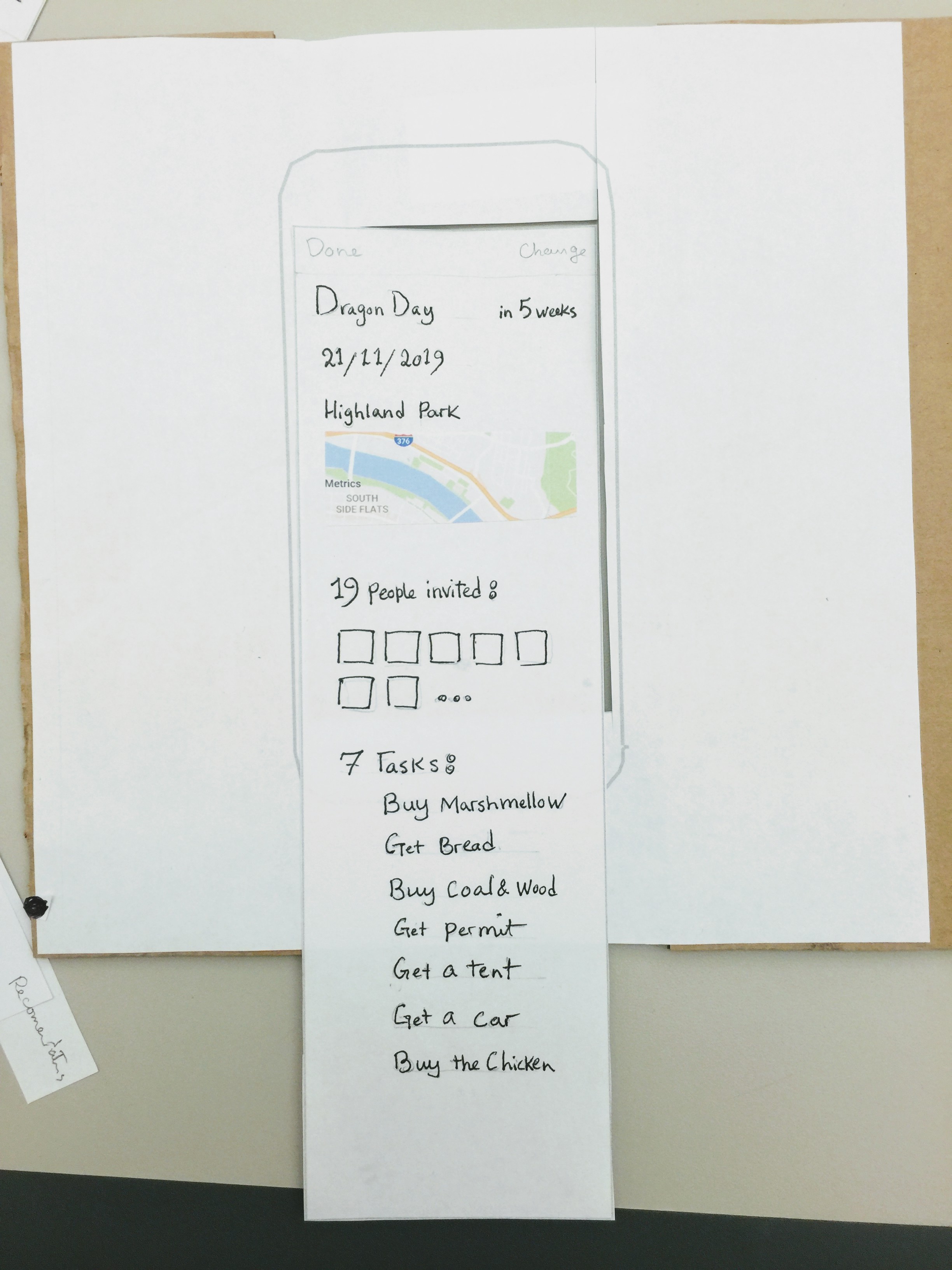
Paper Prototyping
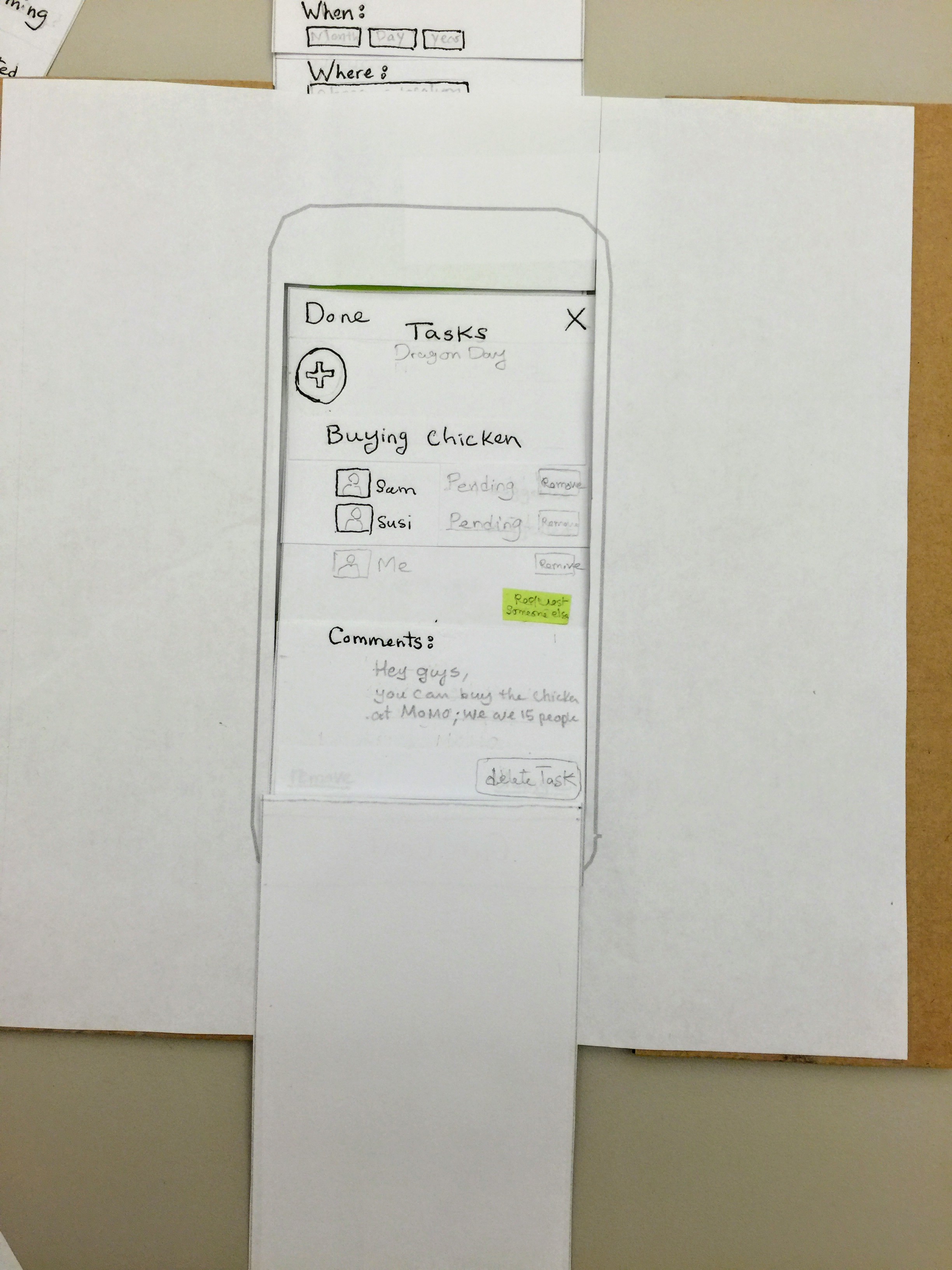
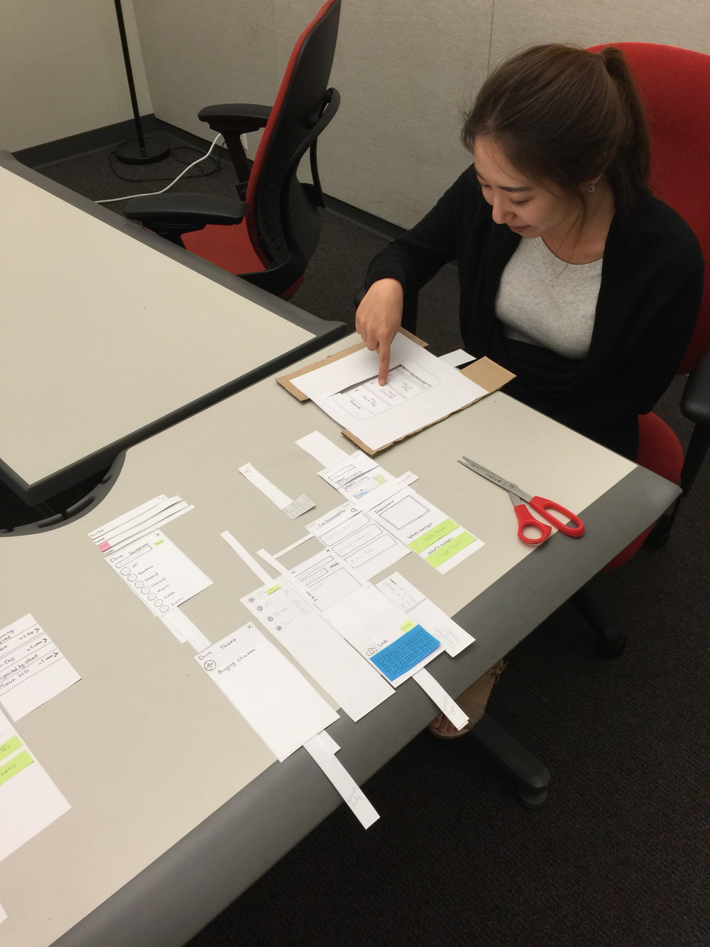
Prototypes allowed me to test the major parts of the flow with campers. Paper prototypes were particularly helpful because they were easy to tweak, and allowed for multiple variations.
User Testing
I tested with six participants, providing them with the following tasks:
Organize a camping trip
Invite friends to the trip
Share tasks with those invited
Go back to the event in order to make a change.
Main outcomes:
I changed part of the taxonomy to better match the participants expectations.
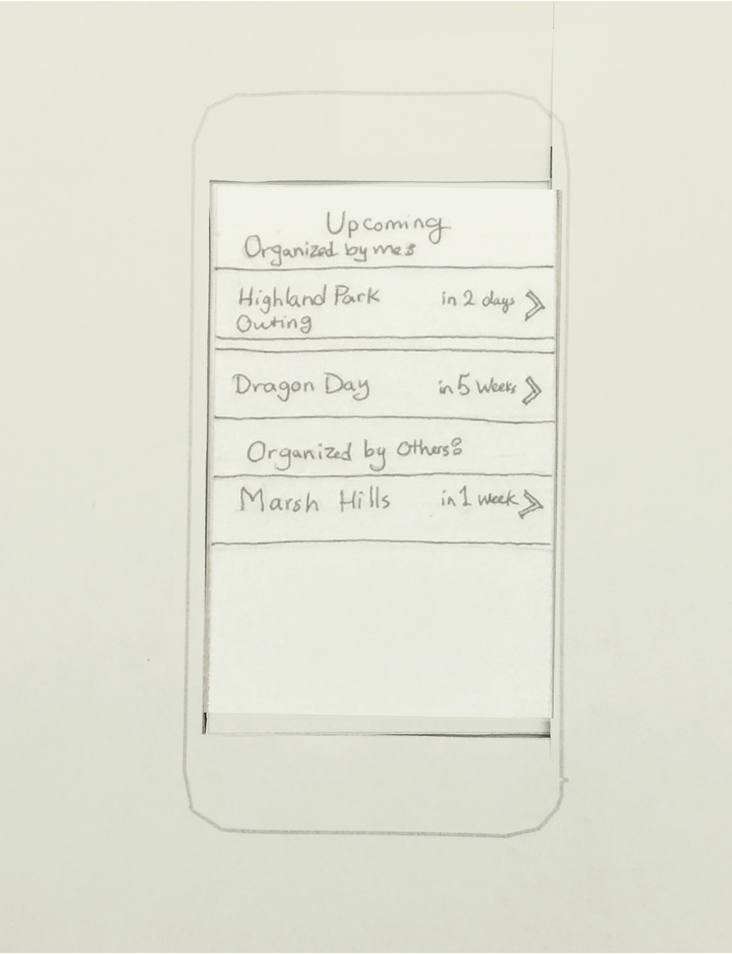
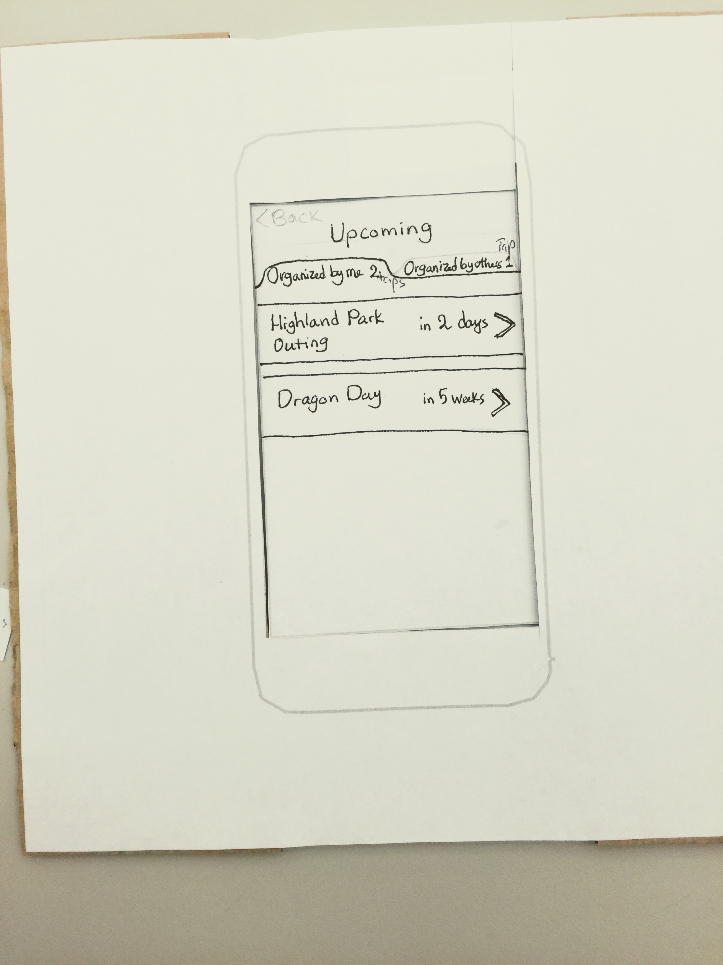
I revamped Upcoming Events layout because it was not scalable.
Animation
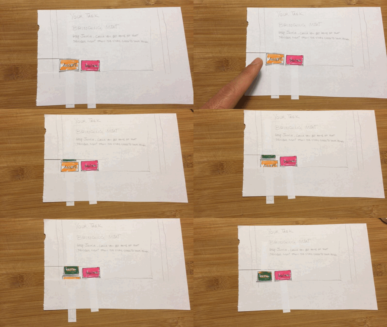
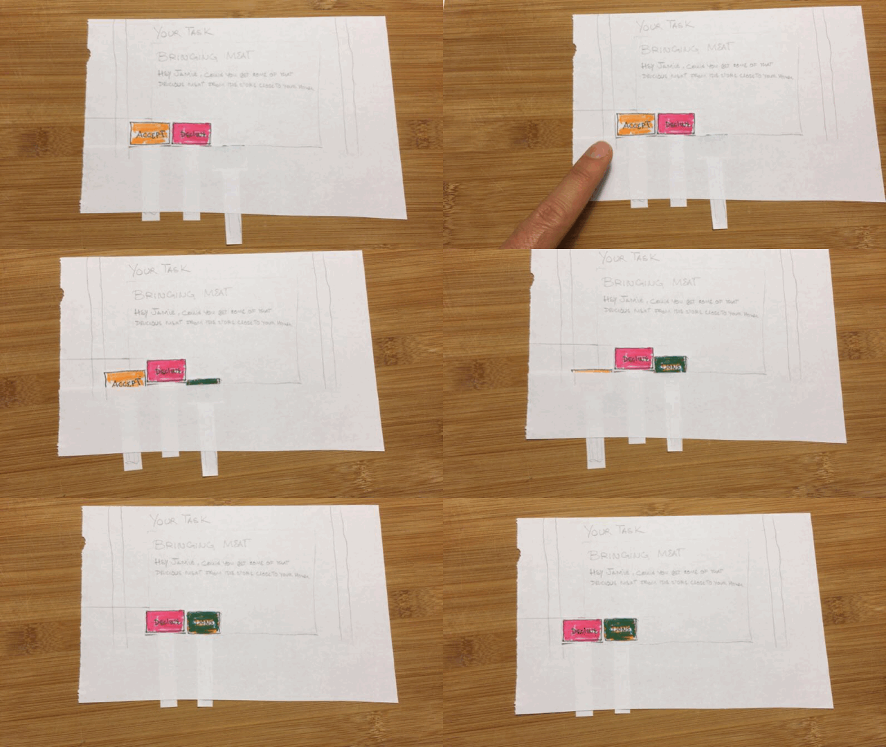
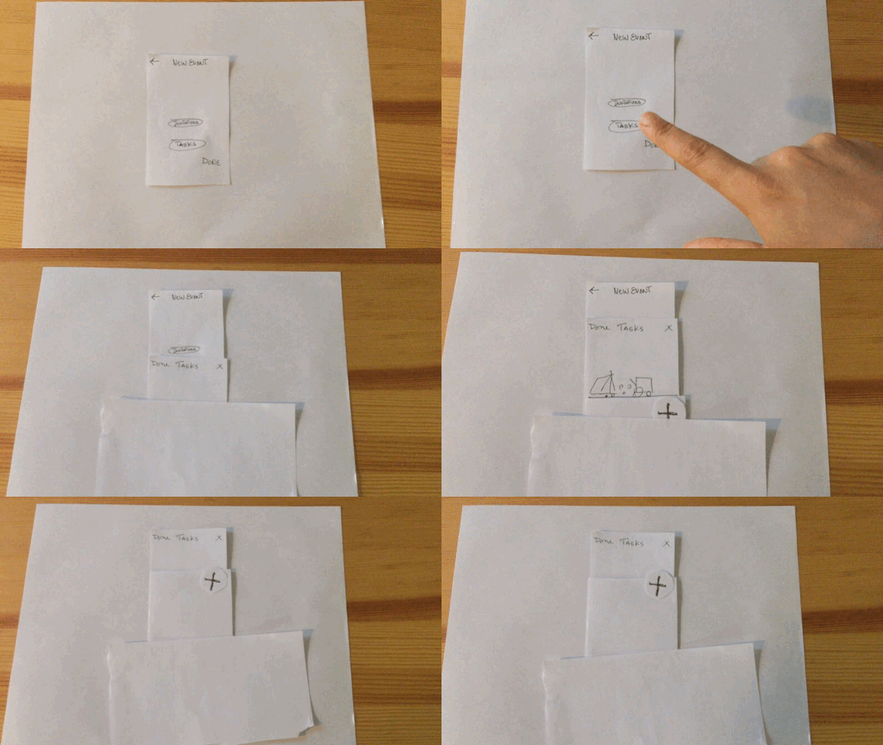
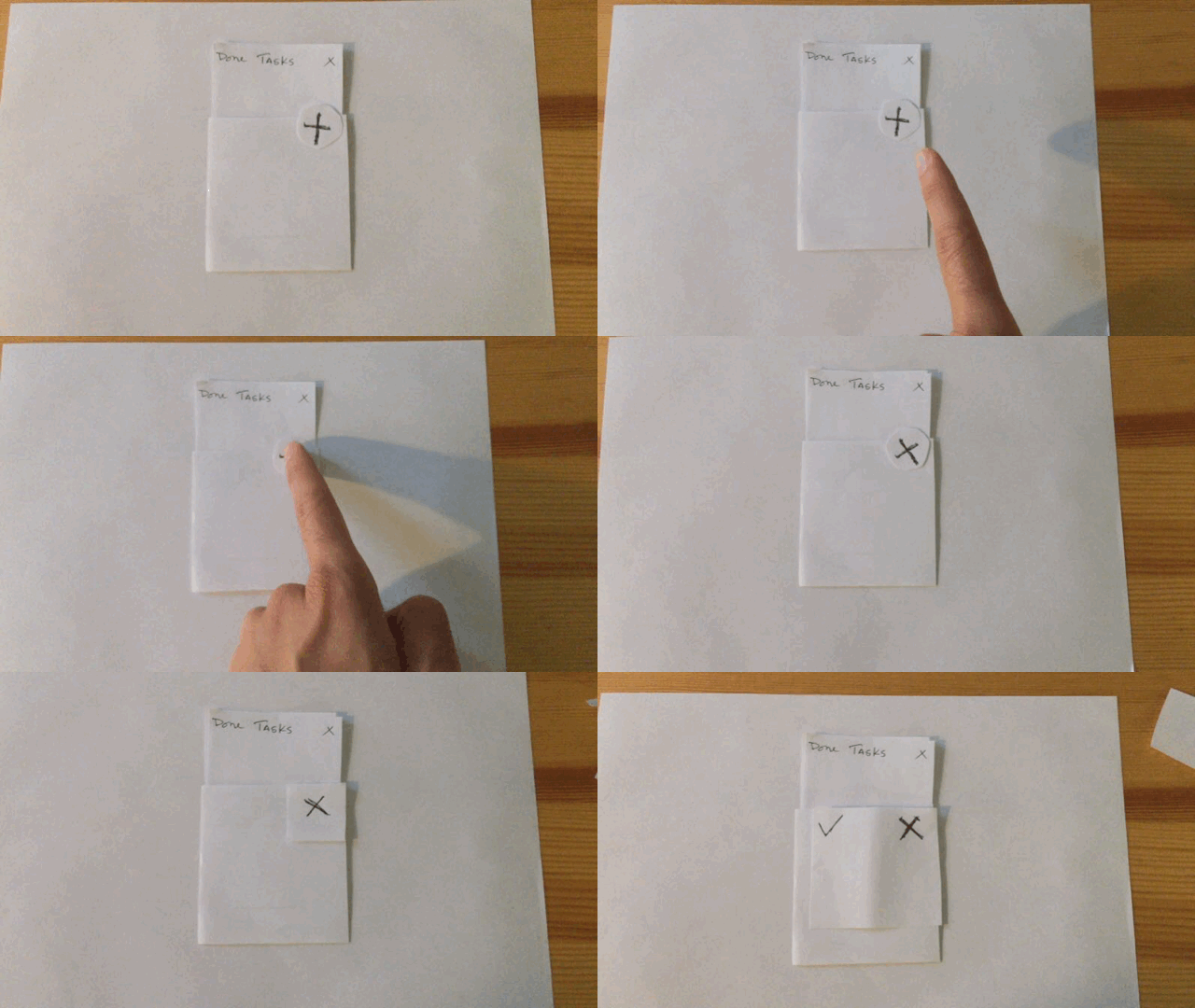
I kept the main . To come up with the right motions, I first prototyped several motions using stop-motion on paper prototypes. I used the videos to gather feedback from my peers.
Transition between accept and done buttons
Task management page transitions
High-fidelity transitions
High-fidelity Testing
I tested with two campers. The objective was to examine the effectiveness of the visual design and the animations. I observed participants and followed up each session with an interview.
The transitions in particular drew out a lot of positive feedback both during the observations and the interviews.
Conclusion
In this project, I was able to address campers pain points with coordination when in a group. At the same time, I was able to make the final solution feel unique to campers. The next step would be to create an interactive prototype and test it with people who are actually organizing a camping trip.
